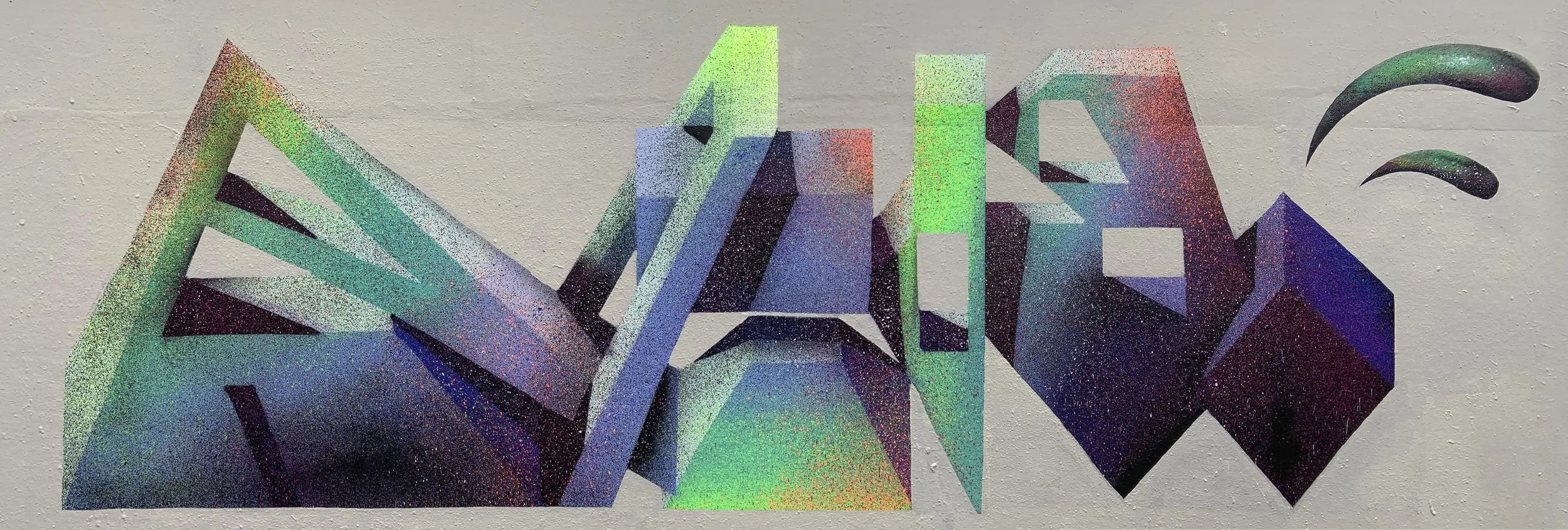
The Creative Works of Roid MSK
A creative vision is something that many develop and master over time, but very little are naturally born with. I’ve encountered a select few personally in my own lifetime, but there are many more I look to when I’m trying to source inspiration from those that think a bit more laterally than the rest; Roid is one of them.
Growing up involved in one of the most important and creative UK graffiti crews throughout the late 90’s and early 2000’s, Roid’s real rise to style prominence with this new moniker begins back in 2008.
When you look at UK graffiti, I don’t think there’s just one style you could point your finger at and really call it a ‘British’ way of looking at letterforms. Over the years it’s taken elements from all over Europe as well as some of the more traditional NY styles that writers in the 80’s were receiving through photo trades, or through the seminal Bibles that were Subway Art and Spraycan Art. Roid’s style has always had a ‘European’ flavour to it, but one that’s uniquely his. Unlike others there’s a sense of evolution with every year that passes, and as he emerges from his cocoon once again, we’re treated to yet another level-up in creativity. Every piece feels like it’s an exercise in learning something new, by constantly progressing, experimenting and pushing the boundaries of whats possible both technically, and what actually constitutes as being a ‘letterform’.
I think the European style of lettering sometimes gets a bad rep for being too simple or not having enough of the foundations of graffiti letter structure to be considered credible, but what Roid does is then layer another layer of absurdity on top with a world of different visual effects that enhance the forms, and attempt to transform them into tangible objects with the essence of touch and feel. It translates some of the rules you might find writers working in 3D considering when thinking about how light hits an object.
To try and learn a bit more about his thought process, we take a look back at a couple of pieces from each real change up of style throughout Roid’s recorded existence, and analyse some of the elements that set him apart from other writers of a similar ilk.
2008 - The Birth of the Name
We start 16 years ago, and the introduction of the Heavy Artillery crew consisting of some of the UK’s most innovative stylewriters, who at the time were producing some of the most eye-catching ‘multi-man’ productions and began garnering attention from those across the pond in MSK.
This first year of style took elements from Roids previous identity and began to evolve it with more fragmented elements, a detail that would feature in a lot of pieces through this year which started adding a bit more texture to the simpler letter forms.
2009 > 2010 - Build it up, and then break it apart.
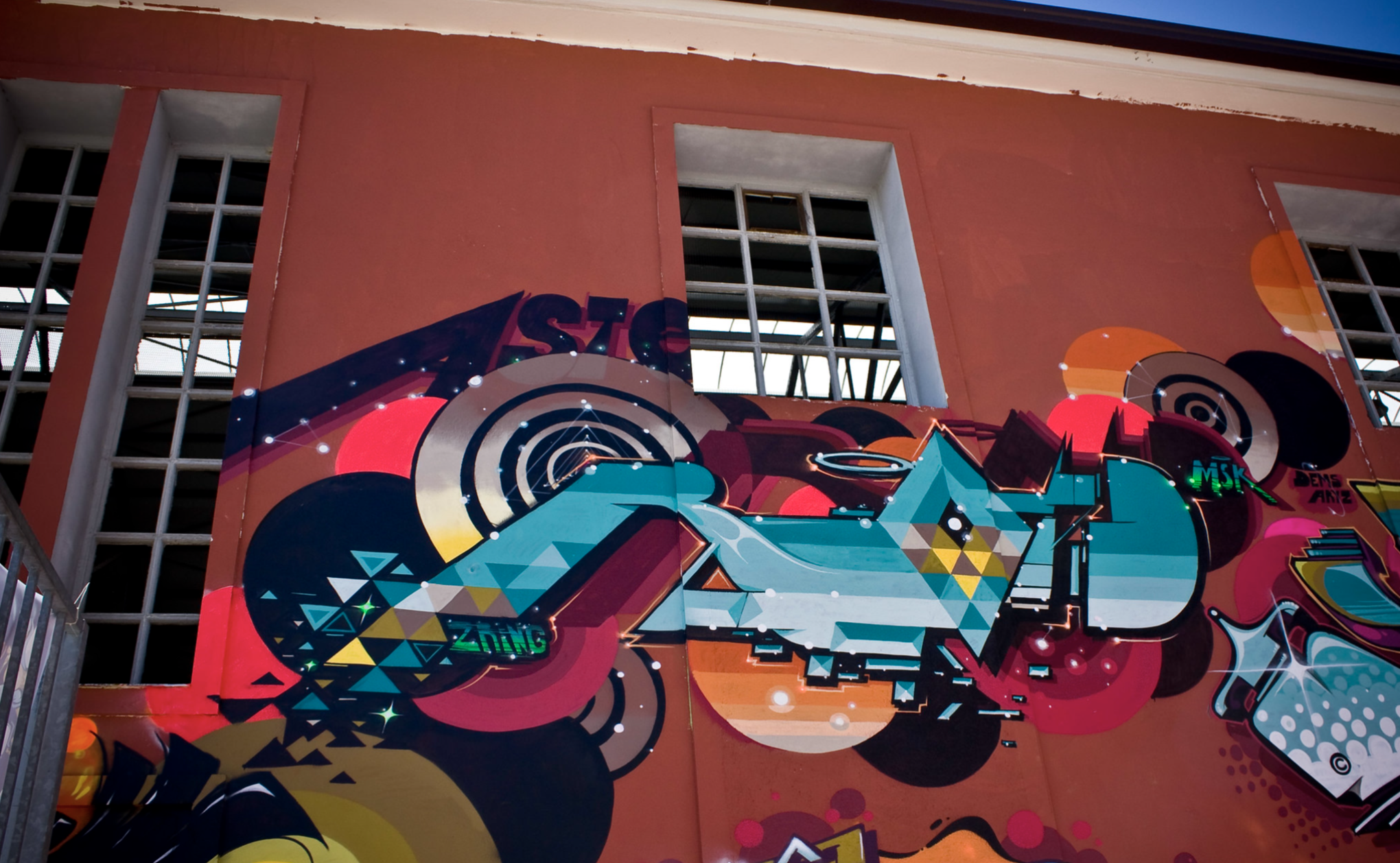
After a year of really solidifying the lettering approach, things started to get a lot more experimental. We see similarities in shapes still, but I feel this is where the beginnings of abstraction really start coming into play. As well as having strong structure to the pieces themselves, we can see a crazy attention to detail added to the backgrounds and the ‘worlds’ in which these letters live.
Space seemed to be a subtle running theme throughout this period, with the additional embellishments of star constellations, and the extension of his name at times to read ‘Asteroid’. This offered opportunities to really explore the space on the chosen wall, and extend everything in as many different directions as possible.
2011 > 2015 - Scatterbrain, and the Art of Deconstruction
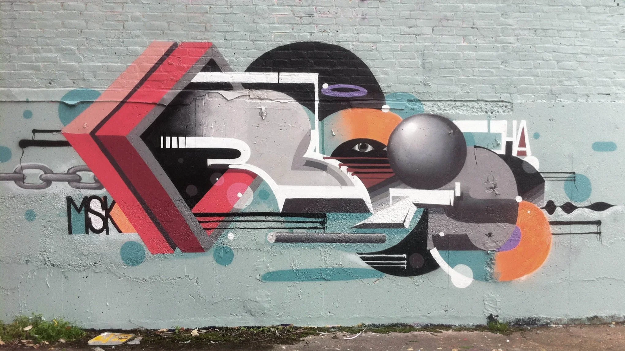
This felt like the start of a real maximalism phase for Roid. Letters were even more distorted than ever, and comprised of layers upon layers to build out the ghosted forms of letters. There’s a lot of texture and depth going on throughout each piece with the use of shadow and bevelled effects to make everything stand ‘off’ the wall. Nostalgia is something noticeable throughout all of his work really, whether that be certain colour palettes, additional details or shapes that instantly conjur up thoughts from the past, or even just the addition of a CD.
2016 - Block by Block
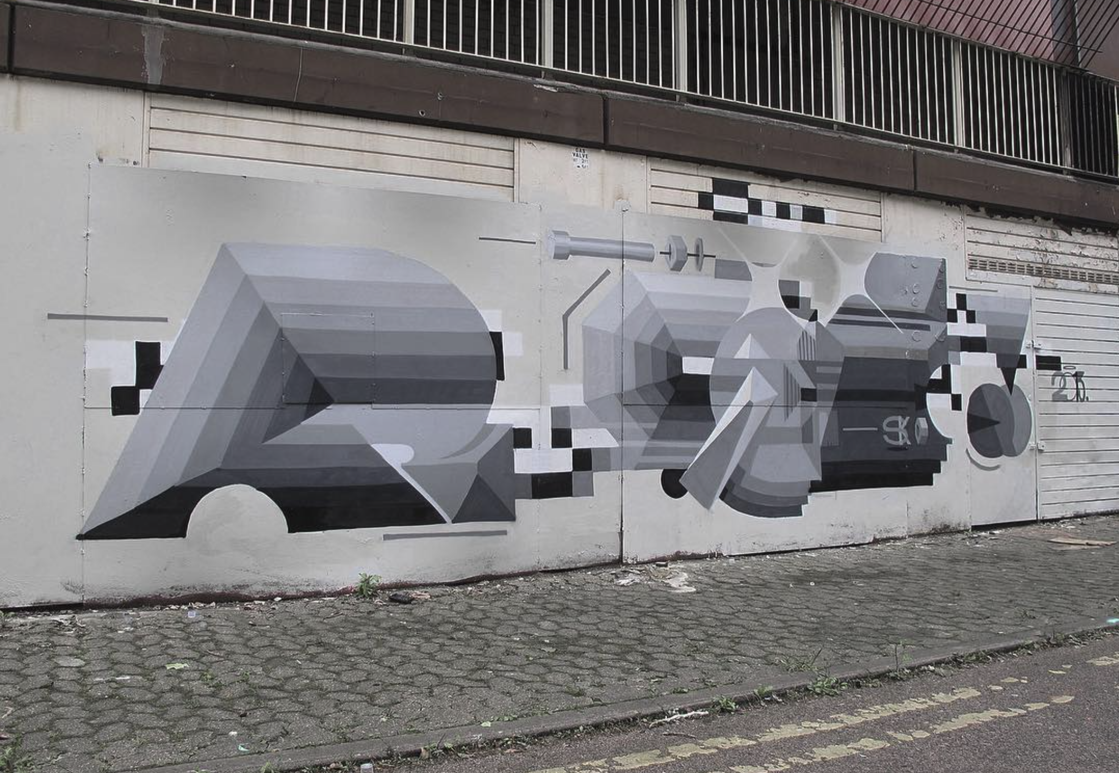
The next real drastic step in style evolution didnt really happen until 2016, where things got a lot more rigid and blocked out in comparison to the more free and bouncy shapes that were present over the previous 5 years. Throughout a lot of the pieces in this era there wasn’t a visible curve in sight, every shape was really carved out and felt strong, and this was further accentuated with the use of bevelling and shadow.
2020 > 2024 - Mouldable Forms
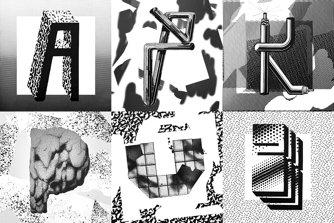
2020 saw another seismic shift in Roids journey, which took a look at what appeared to be an exploration of physical forms. Texture was a very important element to get this look across, and became present in a lot of work beyond this point. These walls feel as though they’re made from clay or plasticine with a really rough, hardened surface. The understanding of both light and the abscence of light, only helps add to the sense of realism when you place it alongside every other element thats been considered.
Another way of further pushing the boundaries of your work, is to switch up your name and give yourself a whole new fresh set of letters to figure out. One of the best parts of graffiti and developing style, is figuring out how you write the same work hundreds, if not thousands of times but in a different way every time. PLASTIC was the name of choice, and Roid seems to have been having a lot of fun with this combination over the last 2 years. The meaning of the word itself also hints towards the introduction of new textures in the work, creating transparent shapes but using flat colour to achieve the effect. It’s a bit of a mind-melter to look at, but when you understand the technique and wrap your head around it it becomes more impressive.
Take a look at more of Roids incredible work at https://www.instagram.com/willis82/
